
OK, let’s talk about plotting libraries in Python.
In January I watched an interesting video (courtesy of Anaconda) about data visualization options in the Pythonverse. In this video, Peter Wang and James Bednar do for Python data visualization libraries what Emmanuel Amiesen did for NLP: start from the project level and talk about the most likely options, rather than cover every single possibility in the field.
Here are my one-page notes from the talk. I’ll also share a bit below about my experiences with some of these libraries.

What is a Project-First Approach?
Why am I calling this a project-first approach? I call it that because, based on project experience, Peter and James are describing the 80-20 of python data visualization projects.
Consider the alternative: the majority of data visualization overviews begin from a theoretical basis. What are all the things we could, theoretically, do with visualizations, and what are all the ways that we might, theoretically, do those things? When you’re in the field building data science apps for customers, you aren’t doing all of those things: you’re doing a very small subset of those things.
Allow me to compare it to the Android stack. If you follow the exercises in Android Programming: The Big Nerd Ranch Guide, you learn to build custom layouts, deploy fun animations, integrate with fingerprint authentication, and even test out the Mobile Vision and Android Voice APIs. But in a year of building Android apps for customers, you’ll spend nine months doing exactly one thing: fetching data from somewhere and displaying it in a list view. You spend 80% of your time doing 20% of what you learned.
Same with data viz. Peter and James wrote a bunch of apps, and they found themselves using visualizations for three things: exploring data, sharing figures in reports, and making dashboards. They describe some libraries with features that enable these three particular things.
The Elephant in the Room
The first thing a Python data visualizer will notice about these notes is that matplotlib does not appear in them. Matplotlib is perhaps the most widely used Python data visualization library to date, and it also underpins several of the highlighted libraries above. I have excluded it from the notes not because it lacks importance, but because it’s not a priority for me to look up on my own time: I’m familiar with it, I’ve used it, and I frequently end up falling back on it when various newfangled options fail me.
Googling
Ah, yes, googlability: the hidden superpower of code libraries. When I want to figure out how to use a library, I google for an example of the thing I’m trying to do. I do this before I look ad the documentation, because up-to-date documentation is unfortunately the exception and not the rule in the open-source world. To be clear, I’m not impugning maintainers for this—y’all spend all your spare time getting yelled at by ungrateful beneficiaries for free on the internet. You’re all saints, and I don’t know how you do it.
But because maintainers don’t have time to futz with the documentation, the dominant source of information on a library comes from the examples and questions posted by people currently using it. The more widely used a library becomes, the more questions and examples get posted. The more this happens, the more google-able it becomes. The more google-able it is, the more widely it becomes used because it’s the one people can figure out how to use. Short of a seamlessly intuitive API that doesn’t require googling, a maintainer can do little to overcome the google-ability of an established competitor.
Bokeh
Bokeh offers a theoretically simpler API to do several of the things matplotlib does.
As you might know, I have worked on some multivariate linear regression visualizations that required bar charts to extend into both the positive and the negative numbers. So far only matplotlib has gotten this job done. I tried to do it in Bokeh (before matplotlib, in fact), but I could not get a consistent result. So I went with matplotlib in the end.
Less than a year ago, neither Bokeh nor HoloViews supported a bar chart that extended into negative numbers. Bokeh tried to fix it a couple of times, but it still didn’t work smoothly until sometime last year, at which point HoloViews didn’t support it. Both have since updated their backends, which is excellent, but it demonstrates a drawback of a newer library that tries to fabricate charts with one line of code. In order to make chart building a one-line operation, maintainers have to abstract away many details of what the chart should look like. To do that, the maintainers make assumptions about what you want your chart to look like, and that becomes the default. The second you need to do something differently than that default, you’re in uncharted territory. If it’s a newer library with fewer users, you cannot google how to change that default. And in many cases, changing that default would mean changing the source code of the library and either using your weird fork or waiting for your PR to get merged in. So you can end up stuck.
This is the beauty of matplotlib: it is not new and the API does not attempt to build complex charts with one line of code. Because it is not new, many people have used it, so it’s highly google-able. The maintainers also go to great lengths to make sure that the matplotlib API stays backward-compatible. This is mostly, as I understand it, to avoid breaking peoples’ chart apps in prod. As a side effect, though, all of that built up how-to google juice stays relevant. Matplotlib is also relatively bricks-and-grout compared to newer alternatives with prefabbier APIs: unless you want literally a blue scatterplot, you have to tell matplotlib exactly what you want the chart to look like. But because you’re building from the ground up, you can design whatever you like. It might take more lines of code, but it can be done.
HoloViews
HoloViews renders HTML for its charts that allows you to incorporate things like annotation and site integration. It can run on top of matplotlib, bokeh, or both.
I considered switching the multivariate linear regression charts to HoloViews for the annotation options. Because these charts portray so much data, I wanted to add hover boxes to explain what was going on anywhere in the chart. I saw a HoloViews example with nice hover boxes, so I decided to give the library a try.
Before I rewrote the matplotlib charts, I test-drove the Holoviews bar charts for a different purpose: I wanted ‘floating’ bars demonstrating the confidence intervals of several series of numbers, with the mean shown in the middle. I could not find support for floating bars in Holoviews, so I decided to adapt: I would stack my interval bar on top of a minimum value bar, which I would make transparent (or white) to match the background so the remaining bar would float.
Unfortunately, the structure of stacked HoloViews bars also supports a very particular use case: aggregating scores of the same type for several categories. My plots involve aggregating scores of different types for the same category. Adapting the data to fit HoloViews’ expectation resulted in the following morass:

But even with that, I had some trouble getting a chart depicting what I needed:
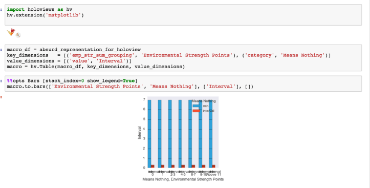

I gave up after a while. This is another example of a situation that expects a very particular type of thing—a default. I suspect Bokeh can adapt to a case like this, but I struggled to find examples of that either in the documentation or on StackOverflow. As much as I believe in the future of HoloViews, I probably wouldn’t lean on it in prod in the present.
Pandas
I use pandas constantly. In fact, I’ve gotten into heated arguments on open-source projects because I wanted to use pandas instead of vanilla Python CSV parsing. CSV parsing works great when your CSV is 75 rows long, but as that CSV reaches thousands of rows, you’ll want something more performant. For me, that’s pandas. Pandas also offers some flexible APIs for data manipulation, grouping, and even basic statistical manipulations. Unfortunately those APIs cannot reach an agreement on whether axis=0 means rows or columns, but luckily the library gets enough use that the answer in your case, though not intuitive, is at least google-able.
Seaborn
Seaborn, in my view, gets frequently underestimated because it has a reputation among data scientists as ‘the thing that makes the matplotlib charts look pretty.’ It does make matplotpib charts look pretty, but it also has some worthwhile functionality of its own; what springs to mind is that you don’t have to explicitly tell it subplots, like you do in matplotlib, to get a grid of plots. This is a case where I don’t tend to customize the look of these plots: I’m usually making a grid to compare data for myself, not show it to a stakeholder. So a quick and dirty grid works great for me—I don’t need to start with bricks and grout. If I did, of course, there’s always matplotlib :).
Conclusion
As is the case with any survey of software libraries, the best choice for you will depend on your unique use case. But in addition to a library’s functionality, you’ll want to consider its google-ability: when you’re lost, how easy is it to google for help on the internet?
As a general rule, the more divorced from a ‘plain’ chart I want to get, the faster I default to matplotlib, which makes no assumptions and lets me build what I want. I’m excited about the future of newer, streamlined libraries like Bokeh and HoloViews, but right now they support a subset of use cases. I’m a big fan of Pandas and Seaborn for data exploration, and they’re almost always present in my iPython notebooks.
If you liked this post, you might also like:
Natural Language Processing: A Project-First Approach
Progress Report on Multivariate Linear Regression Visualizations
Analyzing Relationships Between ESG and Stock Performance